From Botanical Fabric Swatches to Silk: Designing a Vintage-Inspired Scarf Print
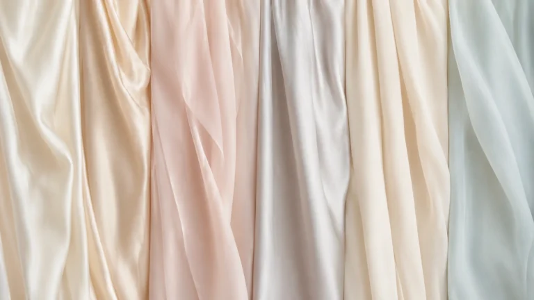
A set of fabric swatches can offer a useful starting point for a scarf collection. Muted greens, warm ivory grounds and botanical motifs create a quiet, collected look that feels suited to cooler seasons. When translating this mood into a custom silk scarf, the goal is to capture the atmosphere while creating artwork that feels original and works well on the finished accessory.
A scarf is a larger, more fluid canvas than a small fabric sample. Its print needs to look considered when laid flat, while also holding together when folded, tied or draped. Here are a few design decisions to make before preparing a sample.
Begin with a restrained color palette
Sage, olive and soft moss green pair naturally with cream, warm beige and muted gray-blue. A touch of faded rose, rust or ochre can add warmth without making the design feel overly bright.
It helps to choose one or two dominant colors, then use the remaining shades as accents. Too many colors competing for attention can make delicate botanical artwork feel busy. A limited palette also makes it easier to coordinate the scarf with different outfits and other pieces in a collection.
Choose a pattern scale that suits the scarf
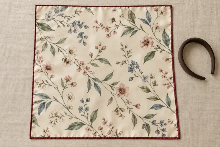
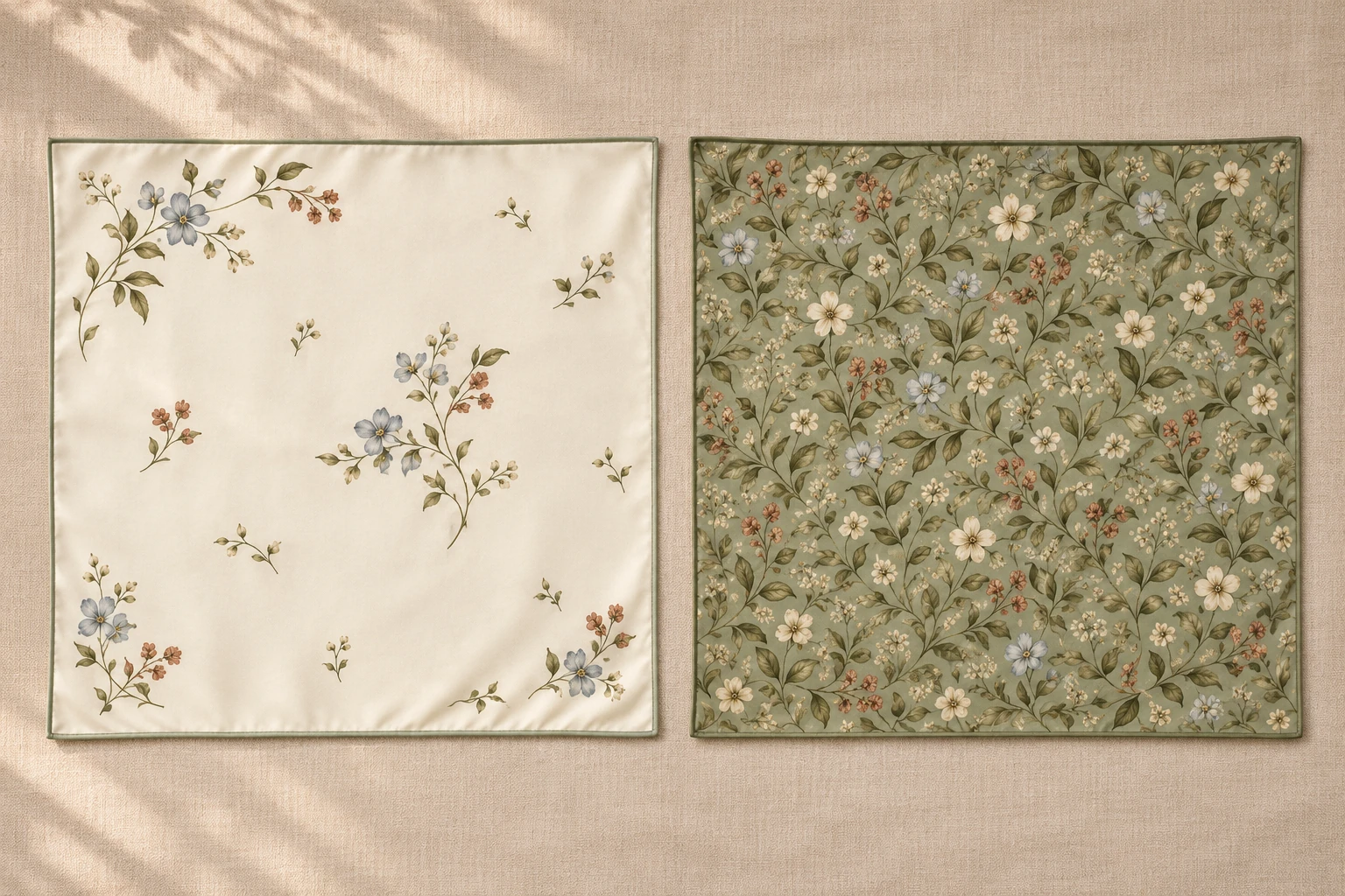
Small leaves and flowers can create a fine, all-over pattern that reads almost like texture from a distance. Larger botanical motifs create more visual impact and give individual illustrations room to stand out.
For a square scarf, a combination can work well: a quieter central field with slightly denser details near the corners or border. For a narrow scarf, the pattern may need to be more linear so the motifs remain recognizable across the slim shape.
Check the artwork at its actual size before sampling. Details that look clear on a large monitor may appear much smaller when printed on a finished scarf.
Balance the print with open space
A vintage-inspired design does not need to cover every part of the scarf. Open areas give the eye a place to rest and help the main motifs stand out. They can also make the scarf easier to style with patterned or textured clothing.
Try a few layout options: scattered floral sprigs, a repeating botanical arrangement or a more decorative border framing a quieter center. The right choice depends on the artwork and how the scarf is expected to be worn.
Give the border and corners their own attention
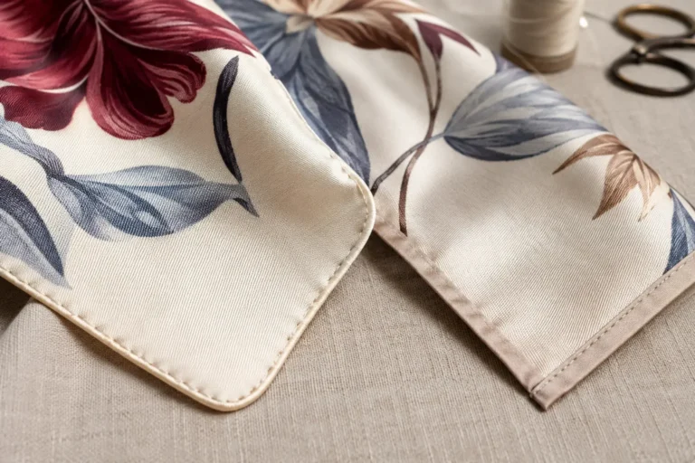
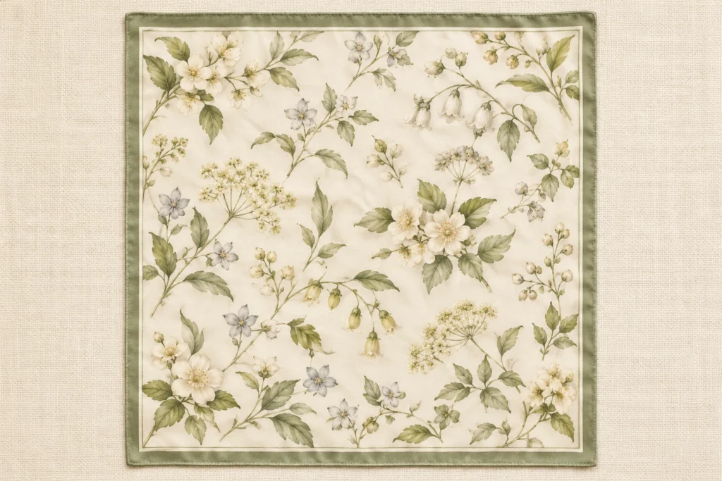
Borders and corners often remain visible when a scarf is folded into a triangle or tied at the neck. A narrow contrasting edge can frame the artwork, while a wider border gives the design a more traditional feel.
Check that the border feels proportional to the scarf size. Make sure corner motifs sit comfortably inside the finished edge, and leave enough room for hemming. If the design includes a logo or signature, test whether it will still be visible after folding.
Consider how the silk affects the finished impression
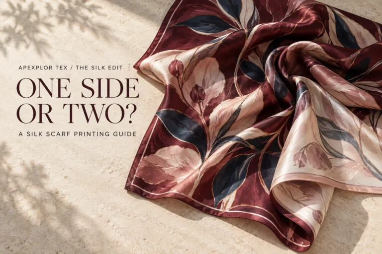
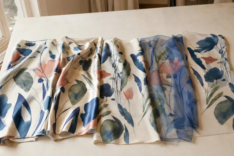
A digital mockup or paper swatch cannot show exactly how artwork will look on the selected silk. The fabric’s surface, weight and finish can affect the print’s appearance, and the way the scarf drapes can change how the colors and motifs are seen.
A sample lets you review the design on the intended material. Look at it in natural light, check fine details up close, then view the whole scarf from a little distance. This helps you judge the balance between color, pattern and open space.
Develop the idea into an original scarf design
A reference swatch can guide the mood of a collection: perhaps the soft green palette, delicate leaves or slightly aged botanical character. From there, the artwork can be adapted into an original layout for a particular scarf size and intended use.
Before moving ahead, review the print at full scale and check the corners, border and finished edges. A physical sample can then help confirm how the artwork and silk work together.
At Apexplor Tex, custom silk scarf projects can start from one piece. Share your artwork, preferred size and fabric choice to discuss the design and sampling details.