How Different Silk Fabrics Affect Digital Printing Results
A digital design does not look exactly the same on every type of silk.
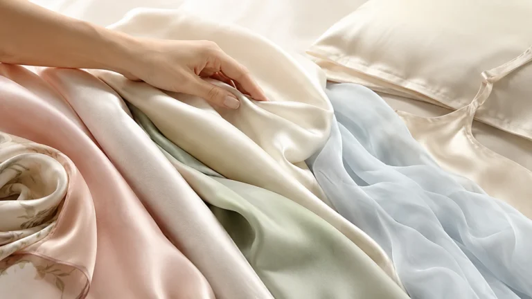
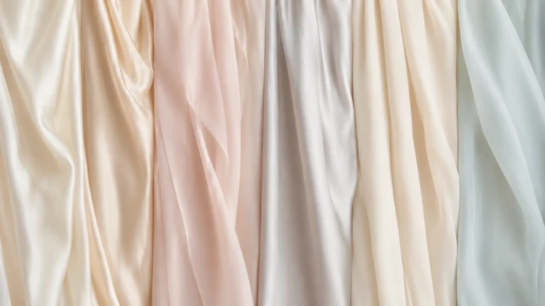
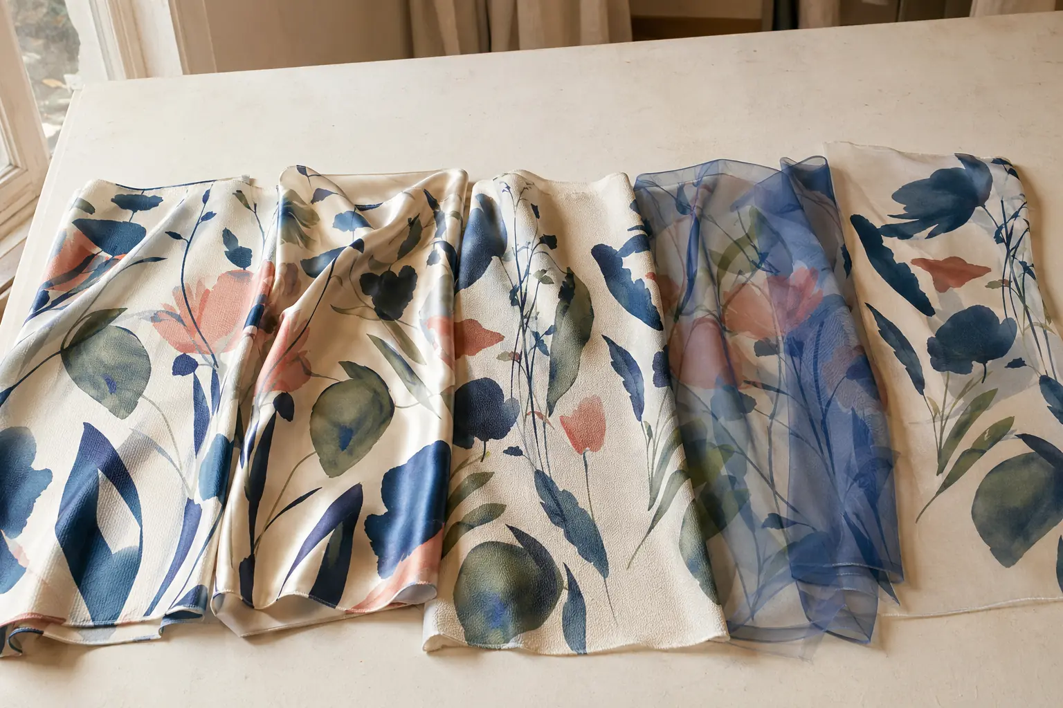
The same artwork may appear vivid and structured on silk twill, luminous on silk satin, softly refined on crepe de Chine or light and translucent on silk chiffon. These differences are not printing errors. They are created by the interaction between colour, fibre, weave, fabric weight, surface texture and light.
For independent designers and premium fashion brands, choosing the right silk is therefore just as important as preparing the artwork. The fabric influences not only the appearance of the print, but also the drape, handle, opacity and overall positioning of the finished product.
Why Fabric Changes the Appearance of a Print
Silk has a natural ability to reflect light, but different weaves reflect and absorb that light in different ways.
A smooth fabric surface can make colours appear brighter and more luminous. A textured or crepe surface scatters light, creating a softer and more understated result. Fabric weight and weave density also affect colour depth, detail definition and how much of the design can be seen from the reverse side.
Several fabric characteristics influence the final result:
- Surface texture affects the apparent sharpness of fine lines and small details.
- Lustre changes how bright or deep a colour appears under different lighting.
- Fabric thickness and weave density influence opacity and reverse-side colour visibility.
- Drape determines how the printed design moves when the product is worn.
- Fabric weight affects the structure and perceived quality of the finished item.
The printing process, colour profile and finishing method also matter, but fabric selection establishes the visual foundation of the product.
Silk Twill: Rich Colour and Defined Structure
Silk twill is recognised by its subtle diagonal weave. It is one of the most widely used fabrics for premium square scarves because it combines strong print performance with a structured, luxurious handle.
Colours printed on silk twill generally appear rich and well defined. The relatively dense construction supports clear borders, geometric patterns and detailed illustrations. Its gentle lustre enhances colour without creating the highly reflective appearance associated with satin.
Twill also holds its shape well, making it suitable for scarves that need to display a recognisable pattern when folded, knotted or worn around the neck.
It is particularly suitable for:
- Classic square scarves
- Detailed illustrations
- Geometric and architectural patterns
- Bold borders and graphic compositions
- Premium fashion and branded accessories
The diagonal texture remains subtly visible beneath the print, adding character without overpowering the artwork.
Silk Satin: Smooth, Luminous and Colour-Rich
Silk satin has a smooth surface and a pronounced natural sheen. Light reflects strongly from the fabric, making colours appear luminous, deep and visually expressive.
This fabric works especially well with artwork that contains rich colour fields, gradients, floral imagery or painterly details. Dark shades can appear particularly luxurious, while bright colours often gain greater visual intensity.
However, satin changes noticeably as it moves. Highlights and shadows can make the same colour look different from one angle to another. This is part of the fabric’s appeal, but designers should consider it when selecting colours and evaluating samples.
Silk satin is often chosen for:
- Luxury scarves and wraps
- Rich floral or artistic designs
- Evening accessories
- Premium gift products
- Designs that benefit from shine and fluid drape
Because the surface is smooth, it can reproduce fine detail very well. Its elegant drape also makes it suitable for products where movement is central to the design.
Crepe de Chine: Soft Texture and Understated Elegance
Crepe de Chine has a finely textured surface and a softer sheen than twill or satin. Rather than reflecting light strongly, it creates a more diffused and sophisticated appearance.
Printed colours can still be clear and expressive, but they tend to feel quieter and less glossy. This makes crepe de Chine particularly suitable for designers who want a refined, contemporary or artistic result rather than a highly polished finish.
Its fluid drape and slightly dry handle also make it comfortable to wear. Organic motifs, watercolour effects, hand-drawn patterns and muted colour palettes often work beautifully on this fabric.
Crepe de Chine is a strong choice for:
- Soft, wearable scarves
- Watercolour and hand-painted artwork
- Contemporary fashion collections
- Muted or natural colour palettes
- Designs with an understated luxury aesthetic
Its subtle surface texture becomes part of the visual character of the finished product.
Silk Chiffon: Light, Transparent and Ethereal
Silk chiffon is lightweight, sheer and highly fluid. Because light passes through the fabric, printed colours usually appear softer and less visually dense than they would on twill or satin.
This transparency can produce a delicate, layered effect, particularly when the scarf is folded or draped. Large motifs, flowing compositions and designs with open space generally work better than extremely small text or very fine high-contrast details.
The reverse side of a chiffon print may look relatively visible because the fabric is thin, although this should not be confused with true double-sided printing. The appearance still depends on the colours, artwork and production process.
Silk chiffon is well suited to:
- Lightweight scarves and wraps
- Soft floral patterns
- Layered or transparent designs
- Bridal and occasion accessories
- Products designed to move freely
Designers should expect colours to feel airy rather than solid. A printed sample is particularly helpful when developing chiffon products.
Silk Habotai: Lightweight with a Clean Surface
Silk habotai has a smooth, plain weave and a soft, lightweight feel. Its even surface can reproduce detailed patterns and clean colour transitions, while its lighter construction allows a good degree of reverse-side colour visibility.
Compared with twill, habotai feels less structured. Compared with chiffon, it is more opaque and has a cleaner, more stable surface. It can be a practical option for lightweight scarves, linings, accessories and projects requiring a soft silk with clear print reproduction.
The final character depends greatly on the selected momme weight. A lighter habotai feels delicate and airy, while a heavier version provides more substance.
How Silk Weight Affects the Result
Fabric type is only part of the decision. Silk weight, commonly expressed in momme, also affects the final product.
Lighter silk generally creates a softer, more transparent and fluid result. It may allow more of the colour to be seen from the reverse side, but it can also make large dark areas appear less dense.
Heavier silk usually provides greater opacity, structure and a more substantial hand feel. It is often preferred for premium scarves where shape, durability and a luxurious sense of weight are important.
A higher momme is not automatically better. The right weight depends on the product, intended season, design style, price positioning and desired wearing experience.
What About the Reverse Side?
For scarf designers, the appearance of the reverse side is an important consideration.
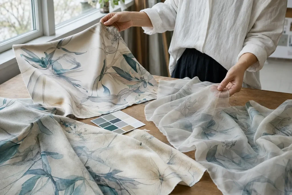
Thinner and more open fabrics often allow more colour to show through, while heavier or denser fabrics may create a greater difference between the front and reverse. Dark colours, highly saturated designs and large solid areas can also behave differently from pale or lightly detailed artwork.
Colour penetration does not mean that the two sides will be identical. Conventional digital printing usually has a designated front side, and the reverse may appear lighter. If a project requires a specific double-sided effect, this should be discussed before sampling and production.
Matching the Fabric to the Design
There is no single “best” silk for digital printing. The best choice is the fabric that supports the creative intention of the design.
Silk twill is often preferred for structured luxury scarves and detailed graphic artwork. Satin enhances lustre, depth and visual drama. Crepe de Chine creates a softer, more contemporary finish, while chiffon supports light and transparent designs. Habotai offers a smooth, lightweight option with good detail reproduction.
When selecting a fabric, designers should consider:
- Is the artwork bold and graphic or soft and painterly?
- Should the colours appear intense, luminous or understated?
- Does the finished product need structure or fluid movement?
- How important is reverse-side colour visibility?
- What level of opacity and fabric weight is required?
- How should the product feel when worn?
These questions help connect the digital artwork with the intended physical experience.
Why Sampling Matters
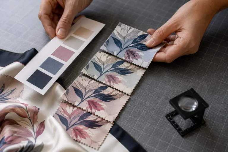
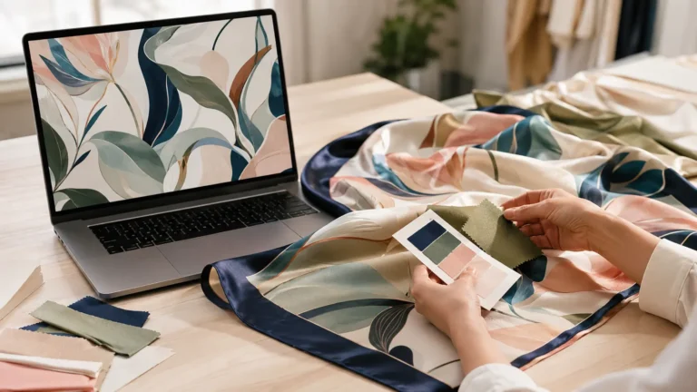
Computer screens cannot fully represent how colour will interact with silk, texture and light. Even when accurate colour references are supplied, different fabrics can produce visibly different results.
A printed sample or strike-off allows the designer to assess colour, scale, detail, fabric texture and overall visual balance on the actual material. For high-end collections, this is the most reliable way to confirm that the selected silk supports the design before bulk production begins.
At China Silk, we review the artwork, intended use and product positioning before recommending suitable fabric and printing options. This helps independent designers and fashion brands make informed decisions rather than selecting silk based only on appearance or price.
Choose the Right Silk for Your Next Design
The fabric is not simply a surface on which the design is printed. It becomes part of the design itself.
If you are developing a custom scarf, fashion accessory or limited-edition silk collection, send us your artwork, preferred dimensions, estimated quantity and intended product style. Our team can help you compare suitable silk fabrics and develop a result that reflects your creative vision.