From Screen to Silk: How to Reduce Colour Differences in Custom Printing
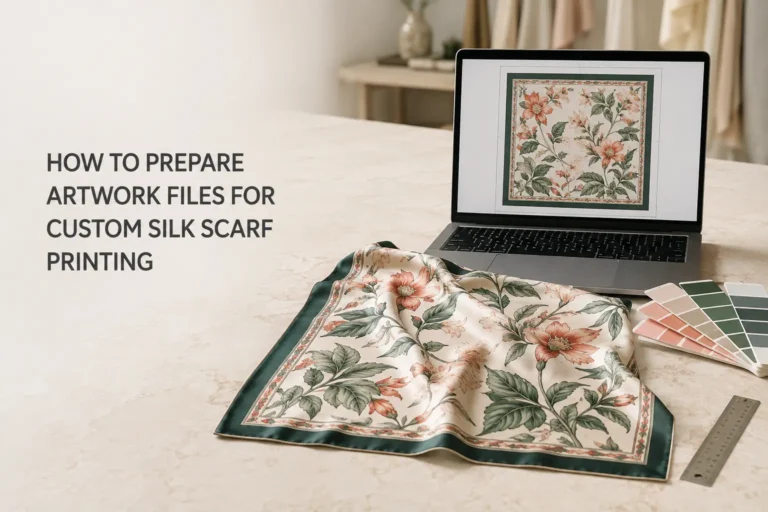
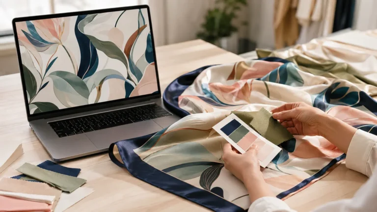
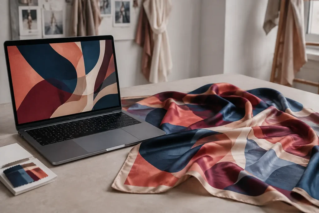
A colour may look perfect on a computer screen but appear slightly different when printed on silk.
This does not necessarily mean that something has gone wrong during printing. Screens create colour with light, while printed silk presents colour through dyes, fibres, surface texture and reflected light. The fabric type, lighting conditions and production process can all influence the final appearance.
Although colour differences cannot be eliminated completely, careful preparation and a clear approval process can make the results much more predictable.
Why Do Screen Colours Look Different on Silk?
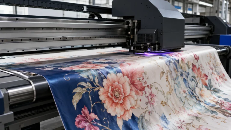
Digital screens use the RGB colour model, combining red, green and blue light to create bright and highly saturated colours. Some of these colours—particularly vivid blues, greens and fluorescent shades—cannot be reproduced with exactly the same intensity on fabric.
The same artwork may also look different on different devices. A colour can appear warmer on one monitor, cooler on another or more saturated on a mobile phone.
Printed silk behaves differently because the final colour is affected by:
✨ The natural tone and texture of the silk
✨ The fabric weave, weight and surface lustre
✨ The ink or dye used during printing
✨ Colour fixation, washing and finishing
✨ The lighting under which the scarf is viewed
For this reason, a screen should be treated as a useful visual preview rather than an exact physical colour standard.
Prepare the Artwork Carefully
Reliable colour reproduction begins with a properly prepared design file.
Designers should send the final, high-resolution version of the artwork rather than a screenshot, social-media image or compressed preview. Suitable formats may include AI, PSD, TIFF or a print-ready PDF, depending on the design.
The artwork should also include an embedded colour profile whenever possible. Repeatedly converting a file between RGB and CMYK can shift colours and reduce the available colour information.
Before submitting the design, check that:
✨ The file is the final approved version
✨ The image resolution is suitable for the required scarf size
✨ Important colours have not been changed by file compression
✨ Gradients, fine lines and small details remain clear
✨ The colour profile is identified and embedded
A calibrated monitor is also recommended. Screens that are overly bright often make colours appear more luminous than they will look on printed silk.
Provide Clear Colour References
Descriptions such as “dark red”, “warm beige” or “soft green” can be interpreted differently by different people. Clear colour references help the designer and printing team work towards the same result.
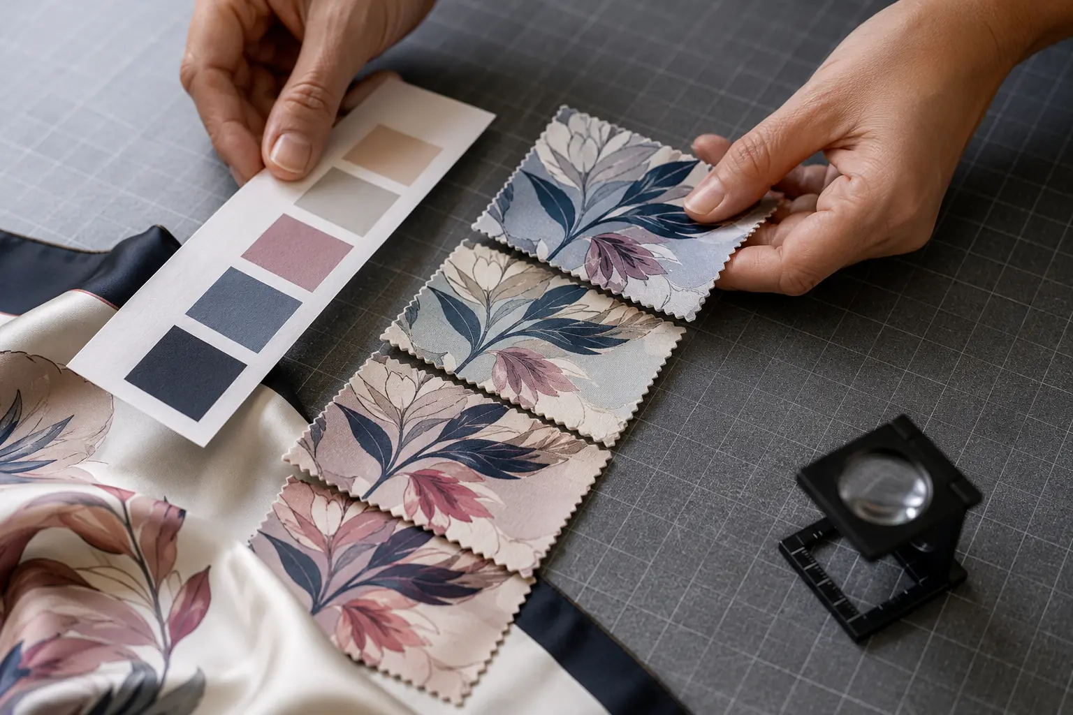
Pantone references, physical fabric swatches, previous product samples or other approved colour standards can all be useful. A physical reference is especially valuable when matching an important brand colour.
However, a Pantone colour printed on paper will not look completely identical when reproduced on silk. Paper and fabric absorb and reflect colour differently, while silk has its own natural sheen and texture.
Pantone colours should therefore be treated as matching targets rather than guarantees of an identical result.
If several colours are important, it is helpful to identify the priorities. For example, a designer may specify that the background colour and logo colour require the closest possible match, while small decorative shades allow more flexibility.
Confirm the Silk Fabric Before Approving Colour
The same artwork can produce very different results on different silk fabrics.
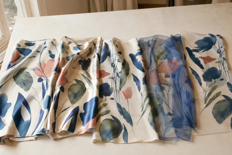
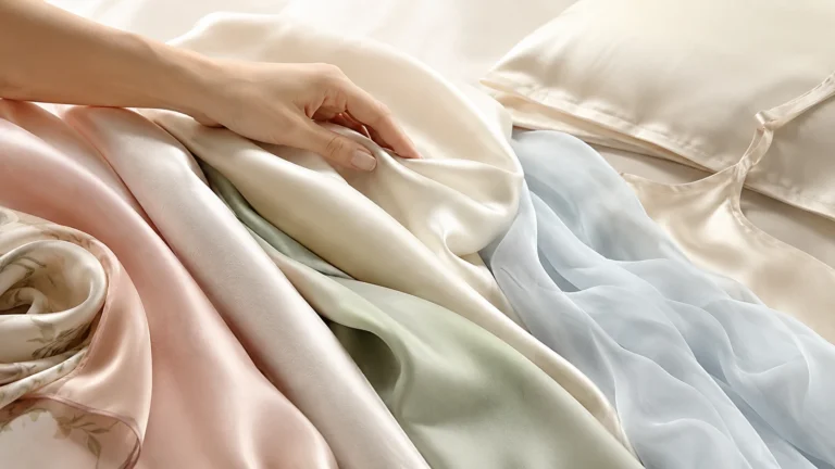
Silk satin reflects more light, making colours appear bright, luminous and expressive. Silk twill usually creates rich colour with defined details and a more structured surface. Crepe de Chine produces a softer, more understated effect, while silk chiffon makes colours look lighter and more transparent.
Fabric weight, usually expressed in momme, also affects the result. A heavier silk generally provides greater opacity and colour depth, while a lightweight silk allows more light to pass through the fabric.
The fabric should therefore be confirmed before the final colour sample is approved.
Changing the fabric type or weight after colour approval can alter:
✨ Colour intensity and brightness
✨ The appearance of dark or saturated areas
✨ Fine-detail definition
✨ Reverse-side colour visibility
✨ Overall lustre, transparency and contrast
Colour approval should always be based on the same fabric specification that will be used for production.
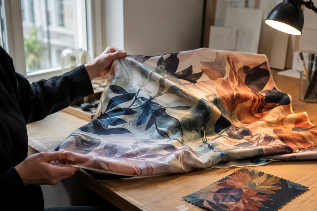
Produce a Strike-Off or Printed Sample
A strike-off is one of the most reliable ways to reduce unexpected colour differences.
It allows a selected part of the artwork—or several adjusted colour options—to be printed on the actual silk before bulk production. The designer can then evaluate the real colour, detail, scale and interaction between the design and fabric surface.
When reviewing a printed sample, compare it with the agreed physical reference rather than a photograph displayed on another screen. Camera settings, lighting, image compression and mobile-phone displays can all change how the photographed colour appears.
For a more accurate evaluation:
✨ View the sample in neutral natural daylight
✨ Check it under the lighting in which the product may be sold or worn
✨ Compare it with the agreed physical colour reference
✨ Examine both flat and draped areas of the silk
✨ Review the colour together with the fabric texture and lustre
Feedback should also be specific. Instead of saying that a colour “does not look right”, indicate whether it should be warmer, cooler, lighter, darker, brighter or less saturated.
Clear feedback helps the printing team make more precise adjustments and reduces unnecessary rounds of sampling.
Approve and Lock the Production Standard
Once the sample has been approved, all confirmed specifications should be recorded and used as the standard for bulk production.
These specifications may include:
✨ The final artwork version
✨ Silk type and momme weight
✨ Approved colour settings
✨ Printing and colour-fixation requirements
✨ Scarf dimensions and pattern placement
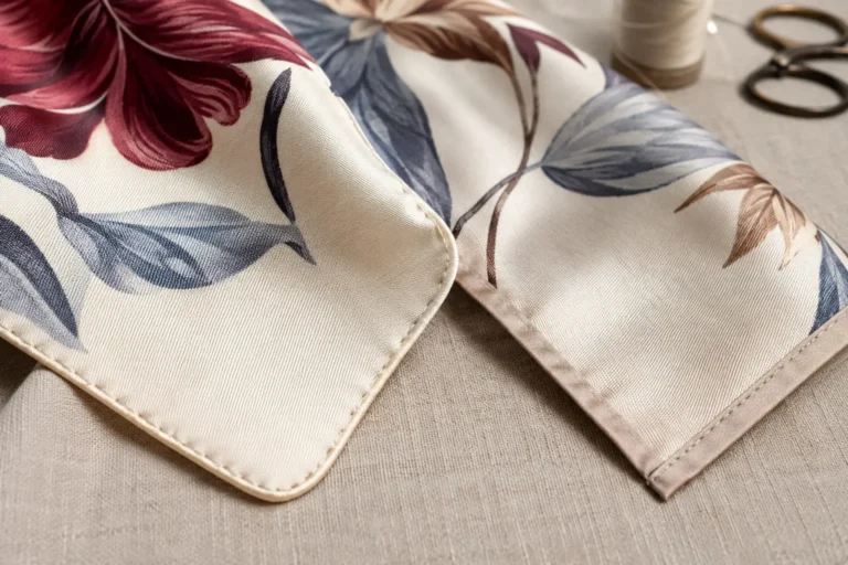
✨ Washing, finishing and hemming details
Changing one of these factors after sample approval may affect the final colour.
For repeat orders, keeping an approved physical sample is particularly useful. It provides a more reliable reference than comparing a new order only with an old digital file or product photograph.
Silk is a natural fibre, and small variations may occur between fabric or production batches. Agreeing on a reasonable colour tolerance is therefore more practical than expecting every piece to look completely identical under every type of lighting.
Common Causes of Avoidable Colour Differences
Many colour problems can be traced back to a few common issues:
✨ Approving colours only on an uncalibrated or overly bright screen
✨ Sending compressed images instead of the original artwork
✨ Using vague colour descriptions without physical references
✨ Approving a sample on one silk fabric and producing on another
✨ Evaluating colour only through mobile-phone photographs
✨ Changing the artwork, fabric or finishing after approval
✨ Expecting luminous RGB colours to print with the same intensity on silk
Addressing these details at the beginning of a project makes communication clearer and helps prevent unnecessary re-sampling.
Can Colour Differences Be Completely Eliminated?
No physical printing process can guarantee that a printed colour will look identical to every screen or remain unchanged under all lighting conditions.
Professional colour management is not about promising “zero colour difference”. Its purpose is to establish a shared visual standard, control the key production variables and keep the finished result within an agreed and acceptable range.
The most reliable process is straightforward:
✨ Prepare the original artwork correctly
✨ Provide clear colour references
✨ Confirm the final silk fabric and weight
✨ Produce and review a printed sample
✨ Lock all approved specifications before production
Bring Your Colours from Screen to Silk with Confidence
Colour is an important part of every designer’s creative language. Managing it carefully helps protect the original design while respecting the natural texture, lustre and character of silk.
If you are developing a custom silk scarf, fashion accessory or limited-edition collection, send us your artwork, preferred fabric, dimensions and colour references. Our team can help you review the project, prepare a sample and confirm the essential production details.